Data Visualization
⚠️ THIS DOCUMENTATION SECTION IS UNDER DEVELOPMENT & REVIEW ⚠️
The Lifebox M&E System integrates with Metabase, a powerful business intelligence tool that enables users to explore, visualize, and share data insights without requiring technical expertise. This section provides comprehensive guidance on creating, managing, and using dashboards to monitor program performance.
Dashboard Builder
The Dashboard Builder is the core feature for creating customized data visualizations. It allows users to combine multiple charts, graphs, and tables into a single view for comprehensive program monitoring.
Key Features and Benefits
| Feature | Description | Benefit |
|---|---|---|
| Drag-and-Drop Interface | Easily arrange visualizations by dragging cards | No technical skills required |
| Real-time Data Updates | Dashboards reflect current data automatically | Always have latest information |
| Interactive Filters | Global filters affect all charts simultaneously | Quick data exploration |
| Auto-refresh | Set automatic refresh intervals (1-60 minutes) | Hands-off monitoring |
| Multiple Visualization Types | Bar charts, line charts, maps, tables, and more | Choose best format for your data |
| Embedding | Embed dashboards in other applications | Share insights externally |
| Scheduled Delivery | Email reports on a schedule | Automated stakeholder updates |
| Mobile Responsive | View on any device | Access anywhere |
Benefits for Lifebox M&E: - Centralized Monitoring: All program indicators in one view - Stakeholder Communication: Share progress with donors and partners - Data-Driven Decisions: Real-time insights for program adjustments - Time Savings: Reduce manual report creation time significantly
Interface Overview
Accessing the Dashboard: 1. Log into the Lifebox M&E System at https://mne.lifebox.org/
- Click the Dashboard tab in the main navigation
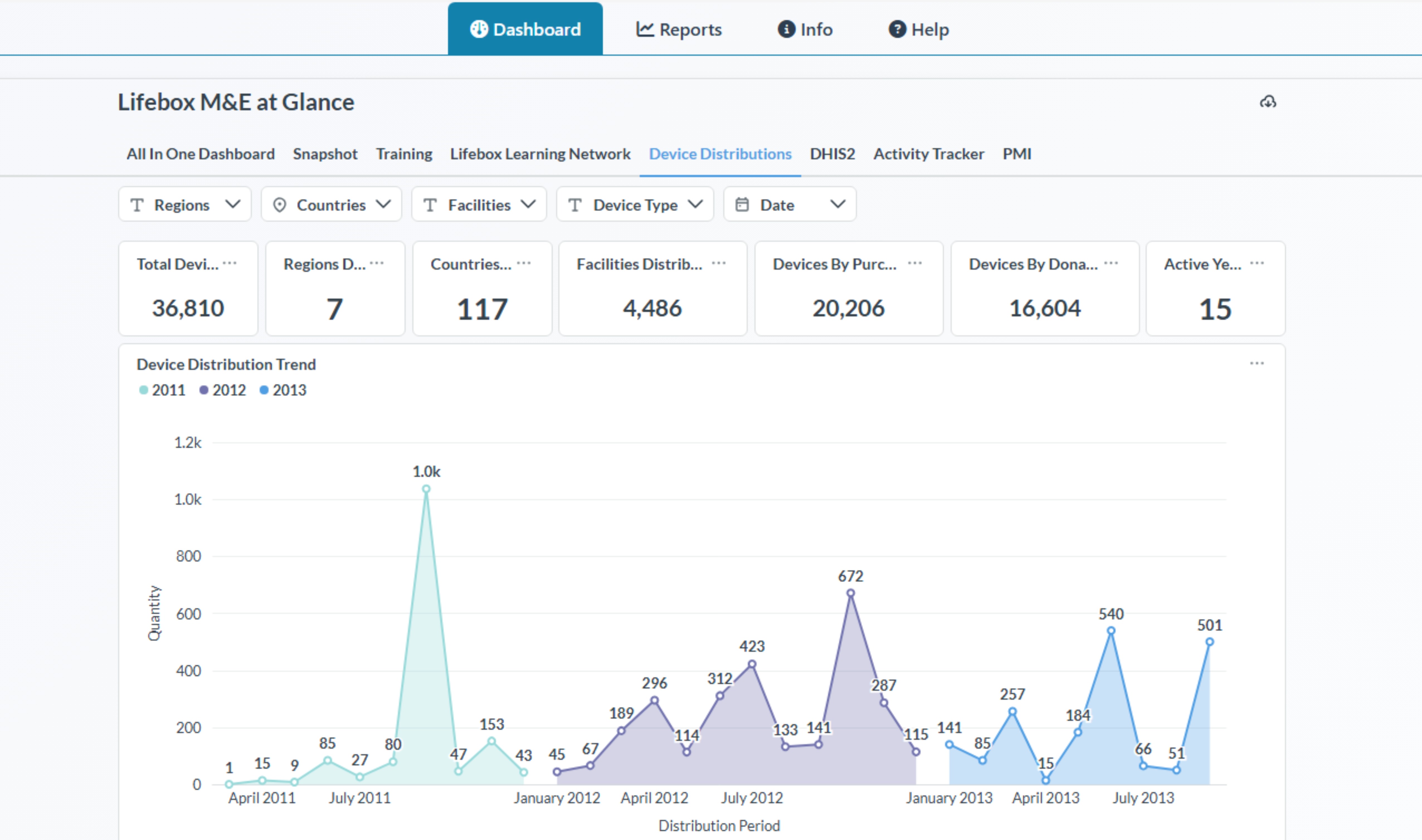
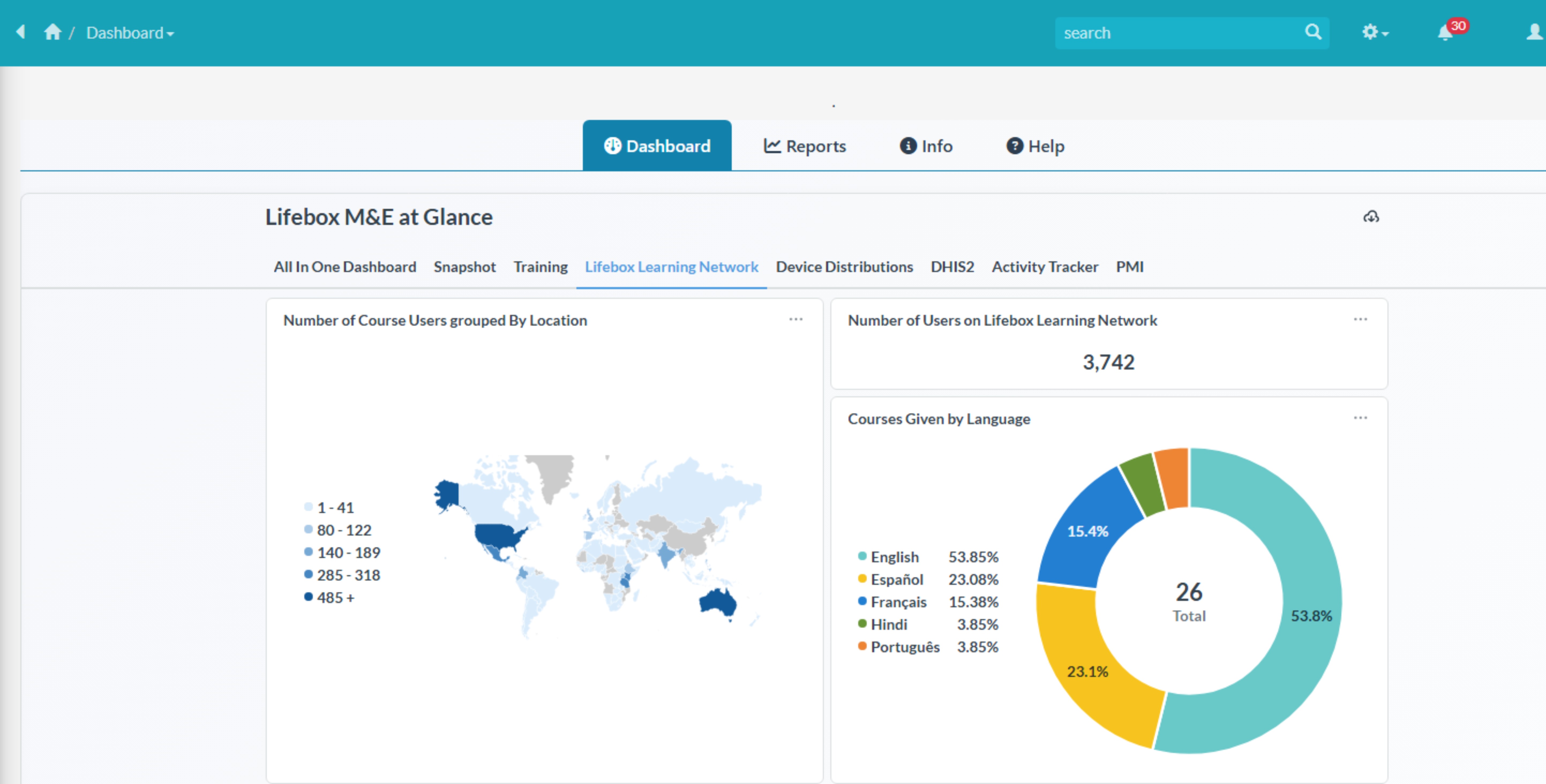
- Select from existing dashboard tabs to look into various dashboards
(Global Indicators (All In One), Snapshot, Training, Lifebox Learning Network, Device Distributions, DHIS2 etc...)
Using the Dashboard
There are various options to go through and explore the data visualizations within the dashboard section.
As mentioned earlier there are prebuilt data visualizations that are embeded within the system which can not be customized from the M&E System. However there are futher operations available within:
Filters:
Each individual prebuilt dashboards have their own filters and also default values so that they will give accurate information and data values.
For Example: - Training 
-
Device Distribution

-
DHIS2

-
PMI (Performance Monitoring Indicators)

Export/Download
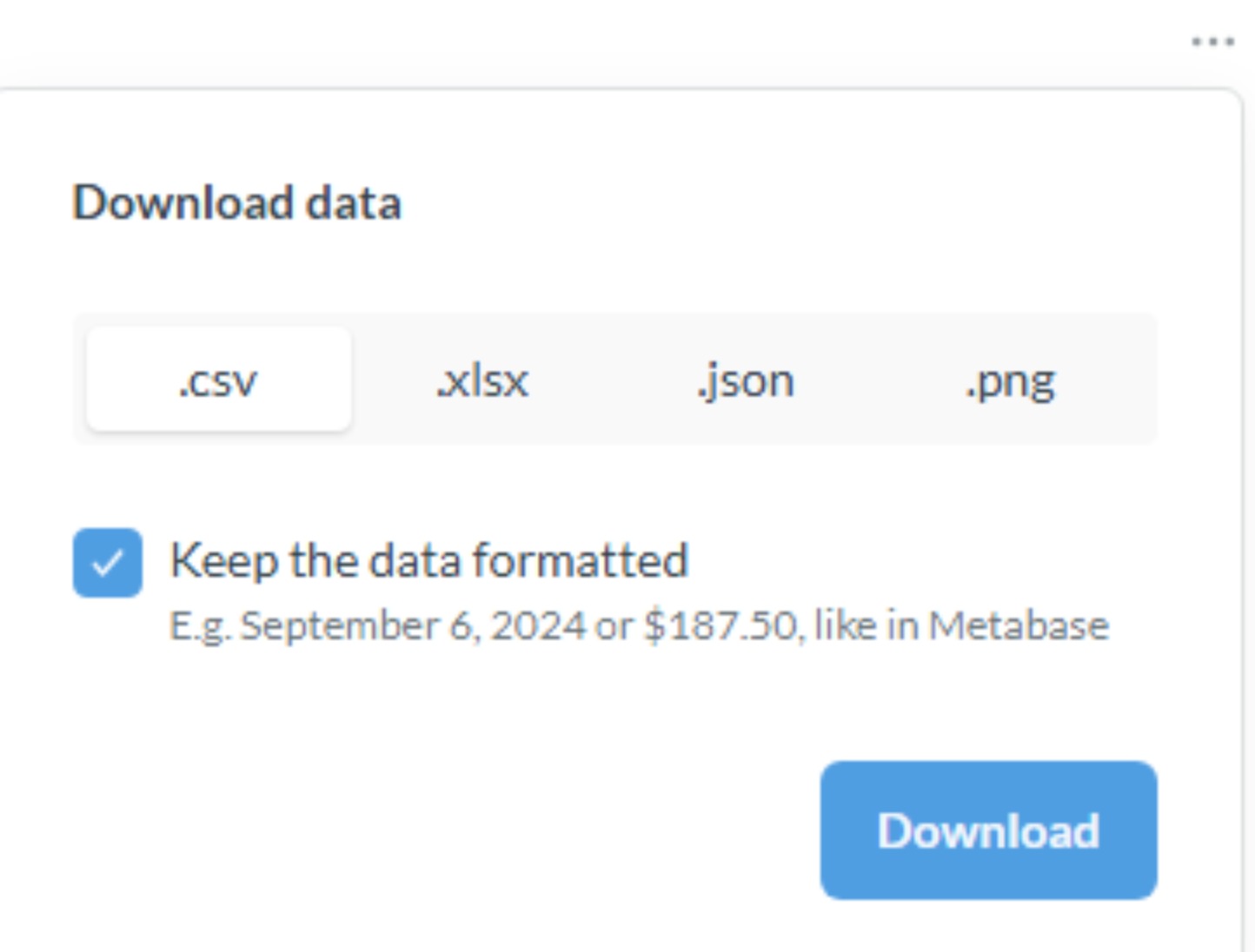
There are various ways of exporting data visualizations's data or charts such as (.csv, .xlsx, .json, .png) formats.
To do these, you will need to first click on your desired chart/visualizations in each visualizations there is a 3 dot (...) and click that and you will see a Download Results button and when you click that you will get the options to download/export to the available formats displayed like the picture below.
Dashboard Components:
Accessing the Dashboard Builder and Analytics via Metabase
Note: To get access you will need to get a permission from Lifebox's M&E System Admin or you will need to be invited.
URL: https://mne.lifebox.org/metabase/
Enter your credentials on the login page correctly if you have Access.
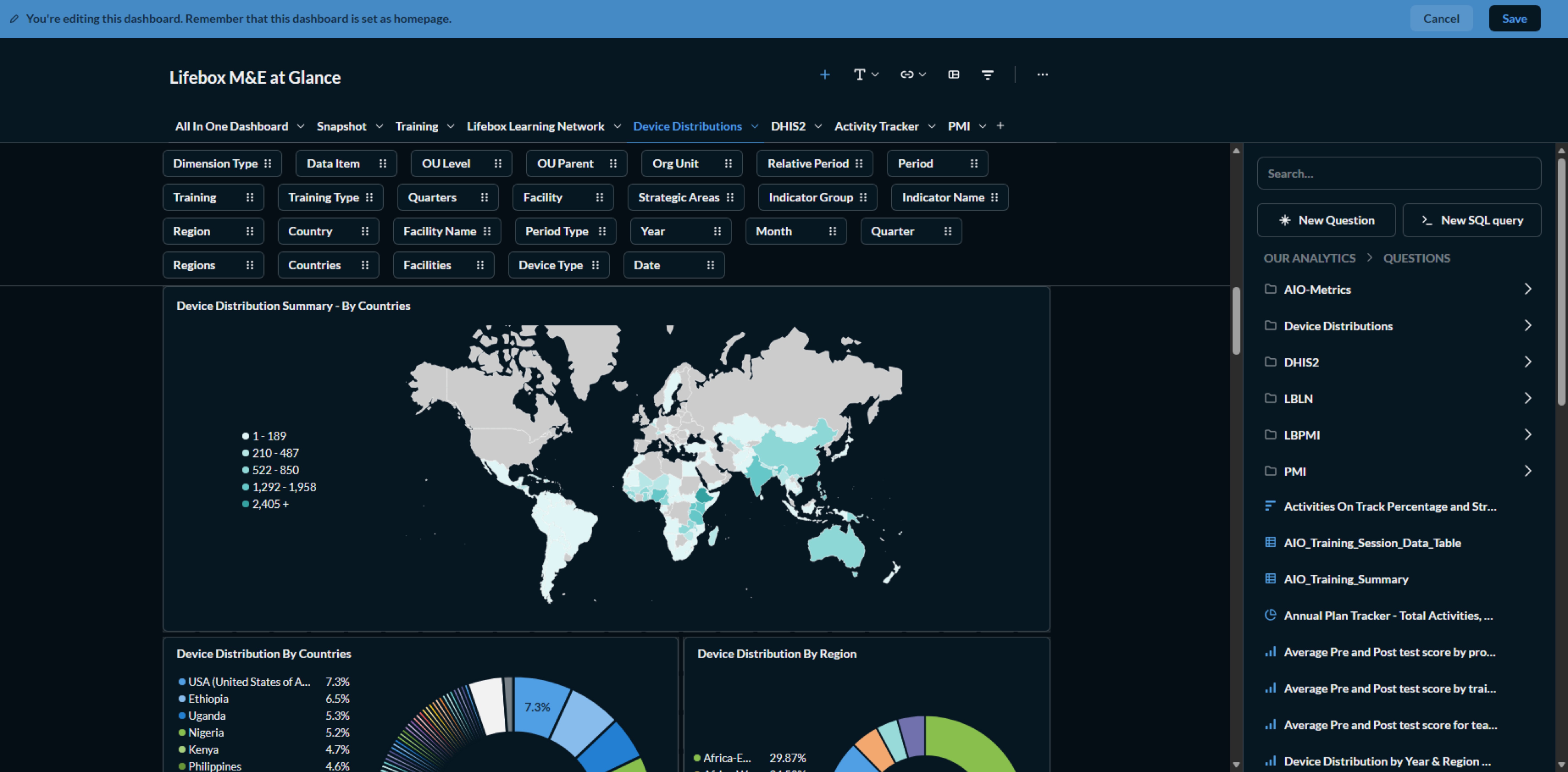
Here the first thing you will get when you are logged in is the (Lifebox at Glance Landing Dashboard page)
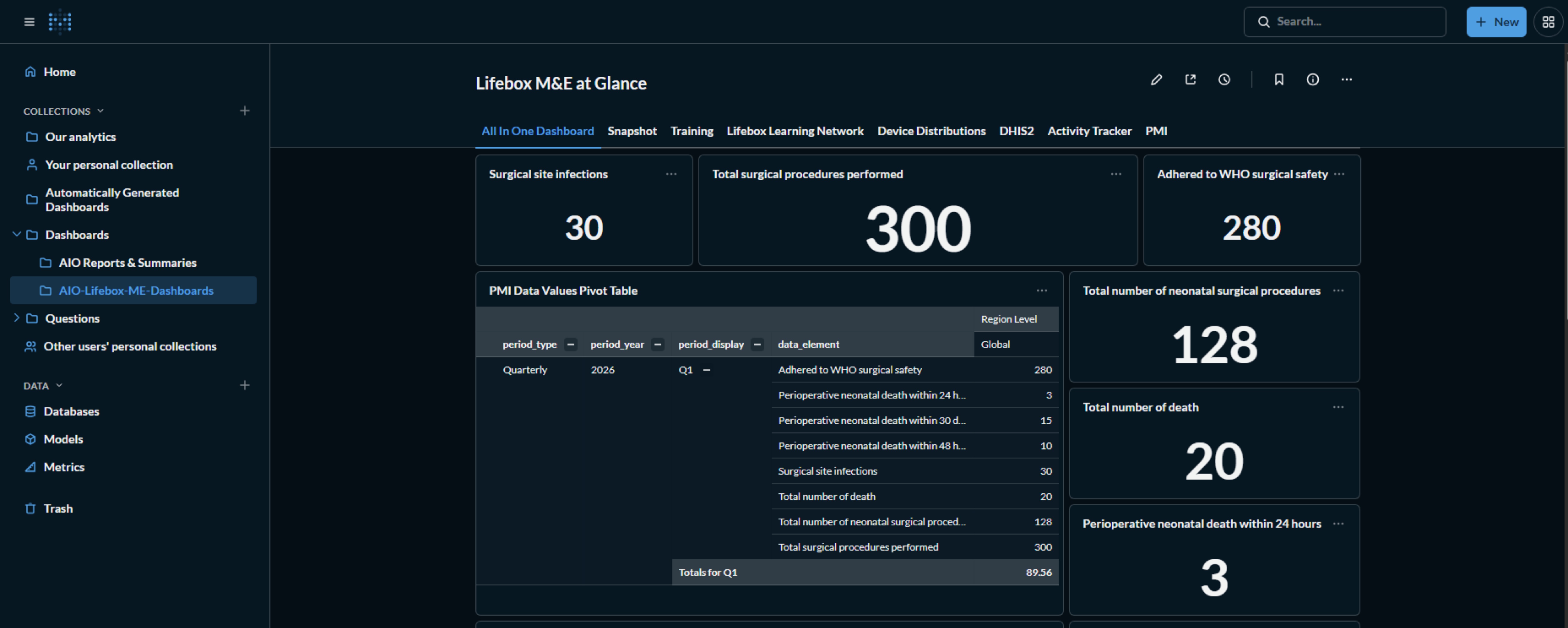
If you have the access to edit/modify the dashboard you can start Editing by Clickin on the Pencil Icon at the top of

Interface Controls:
| Control | Location | Function |
|---|---|---|
| Edit | Top right of dashboard | Add/remove cards, resize, rearrange layout |
| Share | Top right | Get embed code or shareable link |
| Subscribe | Top right | Schedule email delivery of dashboard |
| Filter | Below title | Apply filters across all cards |
| Refresh | Top right | Manually refresh all data |
| Fullscreen | Top right | Presentation mode for meetings |
| Download | On each card | Export individual chart as PNG, CSV, or JSON |
Creating a New Dashboard
Step 1: Access the Dashboard Builder
- From the main dashboard, click Create → Dashboard
- You can also access this from the + icon in the top navigation
Step 2: Configure Dashboard Settings
Complete the following fields:
| Field | Description | Example |
|---|---|---|
| Dashboard Name | Descriptive title for your dashboard | "Lifebox PMI Performance Dashboard - Q1 2026" |
| Description | Brief explanation of dashboard purpose | "Comprehensive view of PMI indicators including training outcomes, device distribution, and learning network metrics" |
| Collection | Folder for organization | "Quarterly Reports" or "Donor Dashboards" |
| Location | Where to save (Personal or Shared) | "Shared" for team access |
Step 3: Add Questions to Dashboard
After creating the dashboard, you'll need to add visualizations (called "questions" in Metabase):
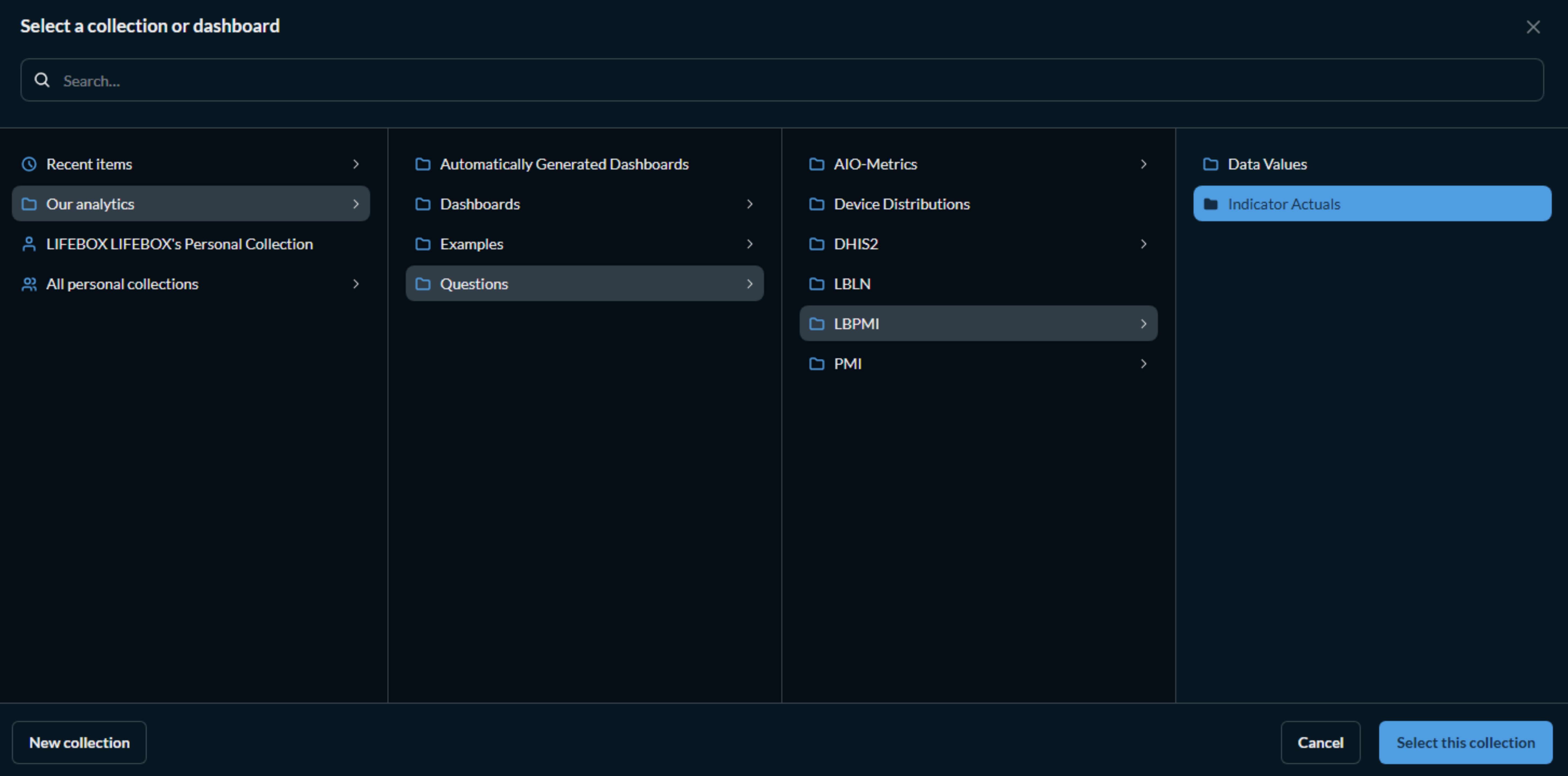
NOTE: The system already have prebuilt questions and collections that you can use to add to your Dashboard which can be found on the left side bar as the picture below.
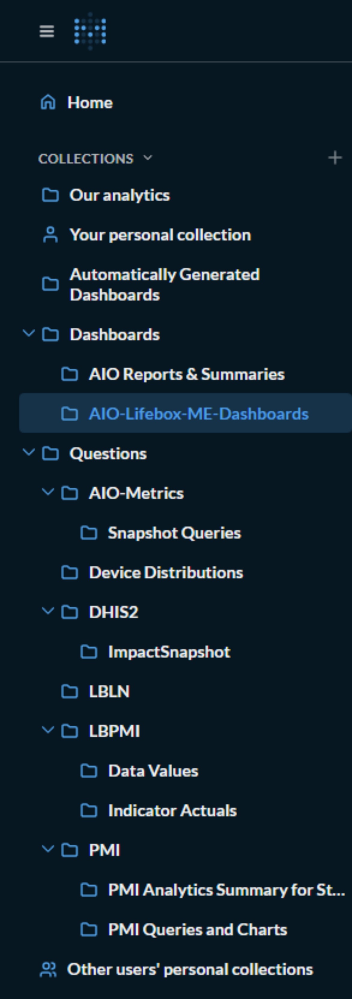
Note: the List of Collections depends based on your access level!
Below are the steps for you to Add Questions from Collections to your Dashboard.
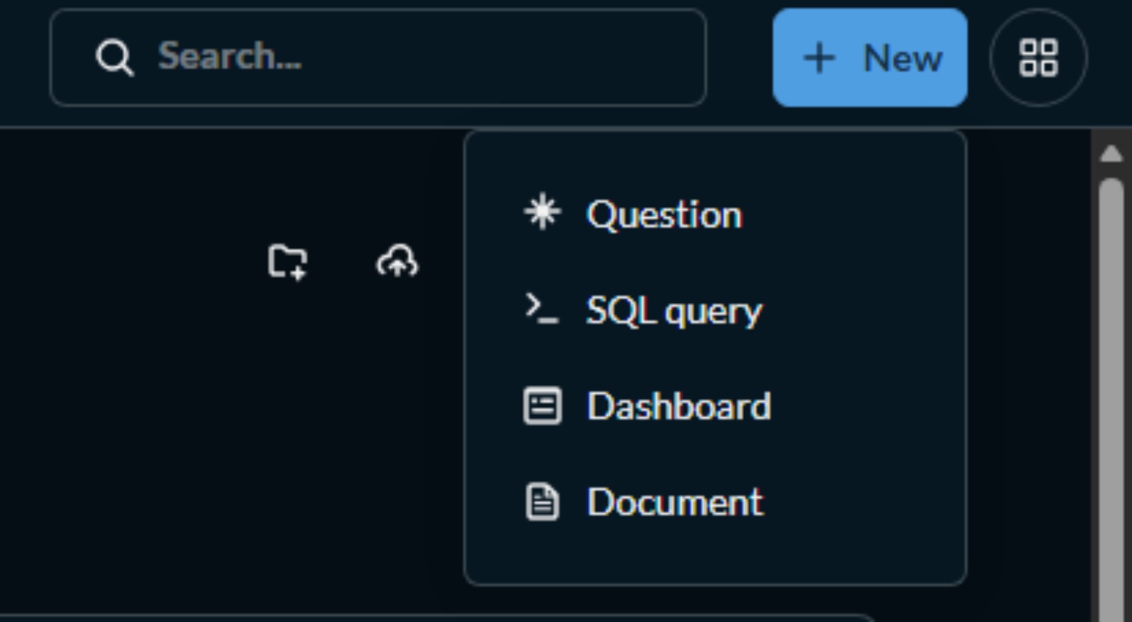
- Click Add questions or the + icon
- Choose from:
- Existing Questions: Use previously saved visualizations which are already stored in your personal collection or stored in Questions Collection which are already designed (You only Need to Select the Question in this case)
- New Question: Create a new visualization from scratch
- For each question, you can:
- Resize: Drag corners to adjust size
- Reposition: Drag to move cards
- Configure: Double-click to edit settings
For More Visual guide have a look at what you should be looking when you are adding a Question(s) to your Dashboard.
Step 4: Create New Visualizations (Questions)
Creating a Simple Visualization:
- Click Create → Question
- Choose question
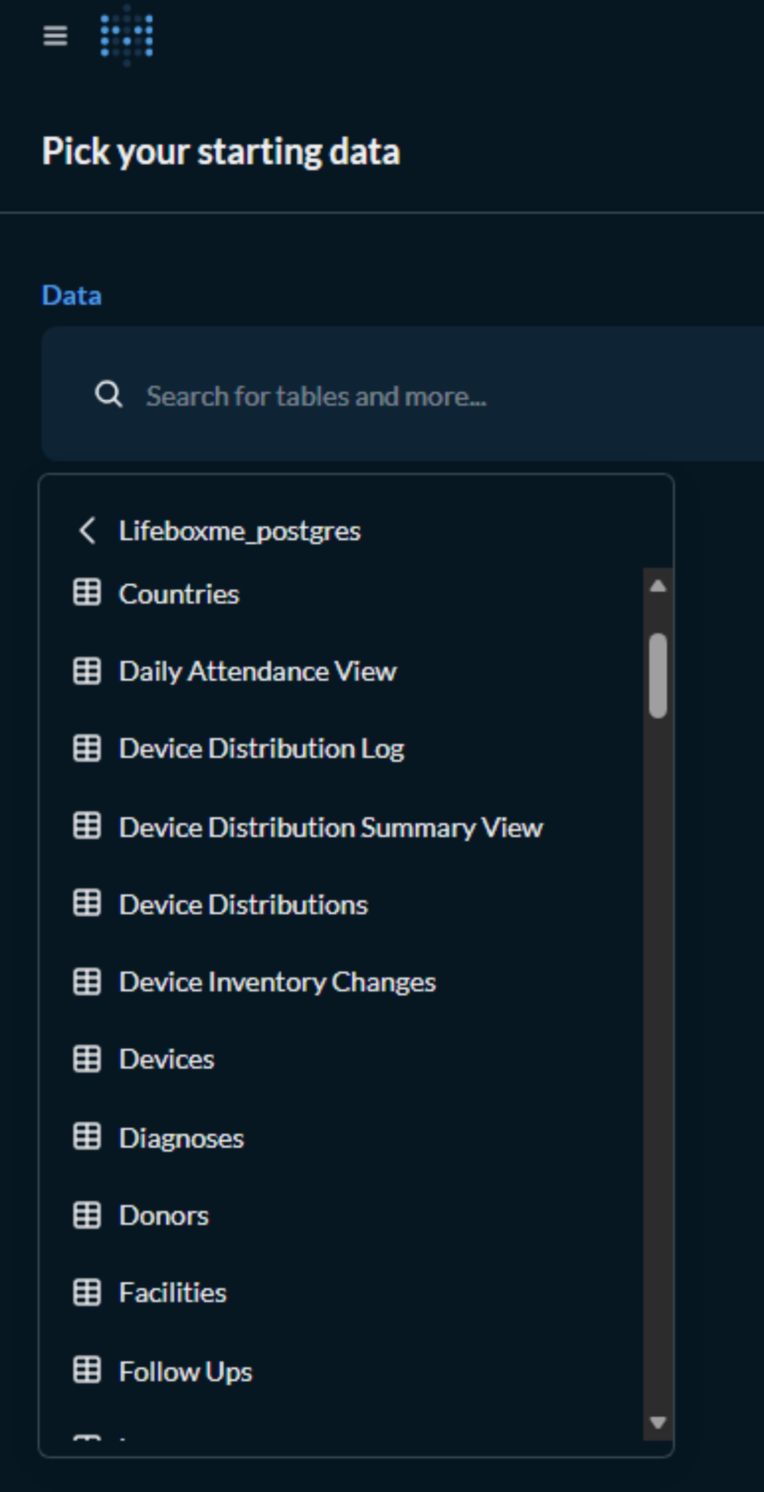
- Select your data source:
data_valuesfor PMI datatraining_participantsfor training datadevice_distributionfor device trackingindicator_actualsfor indicator performance
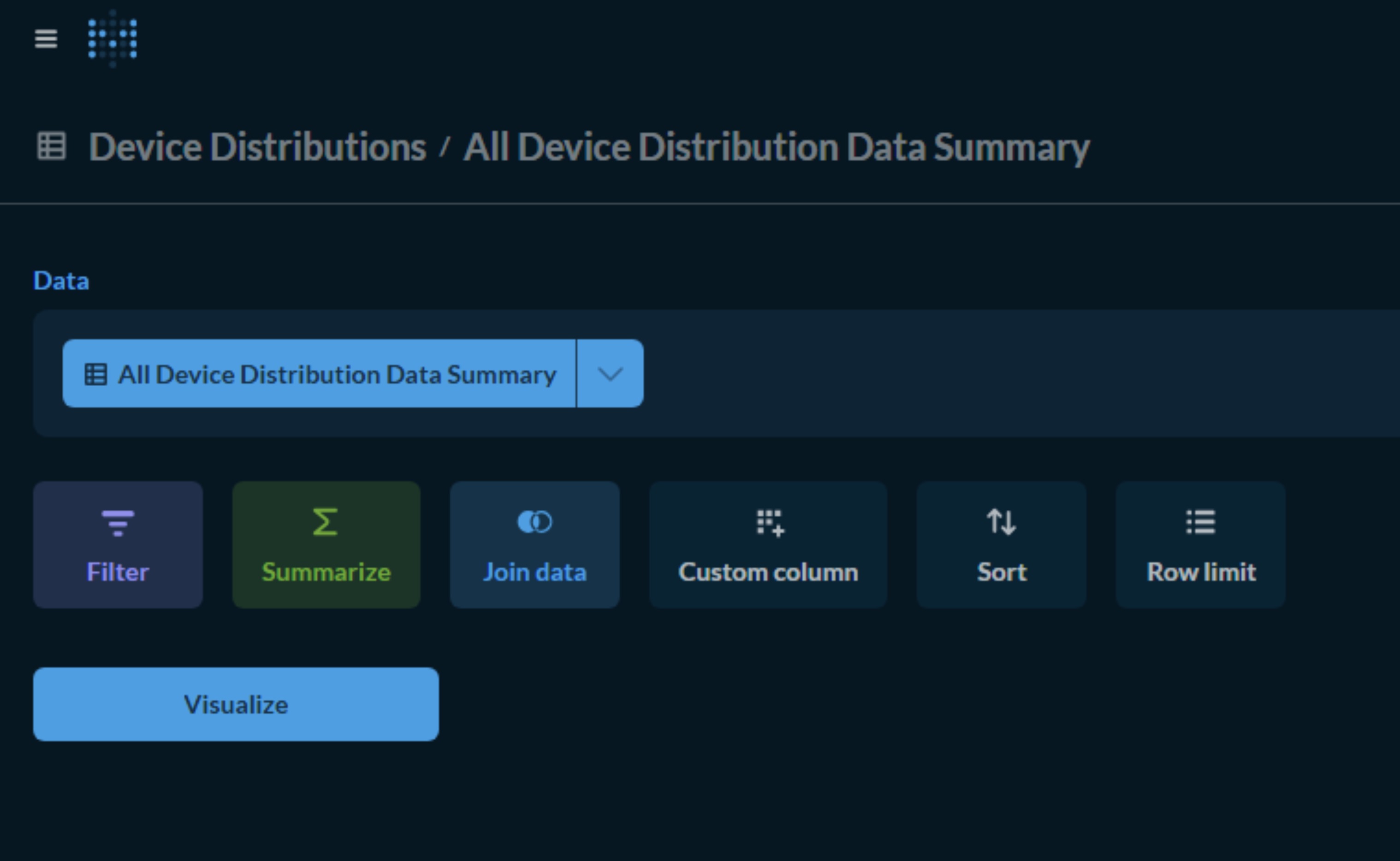
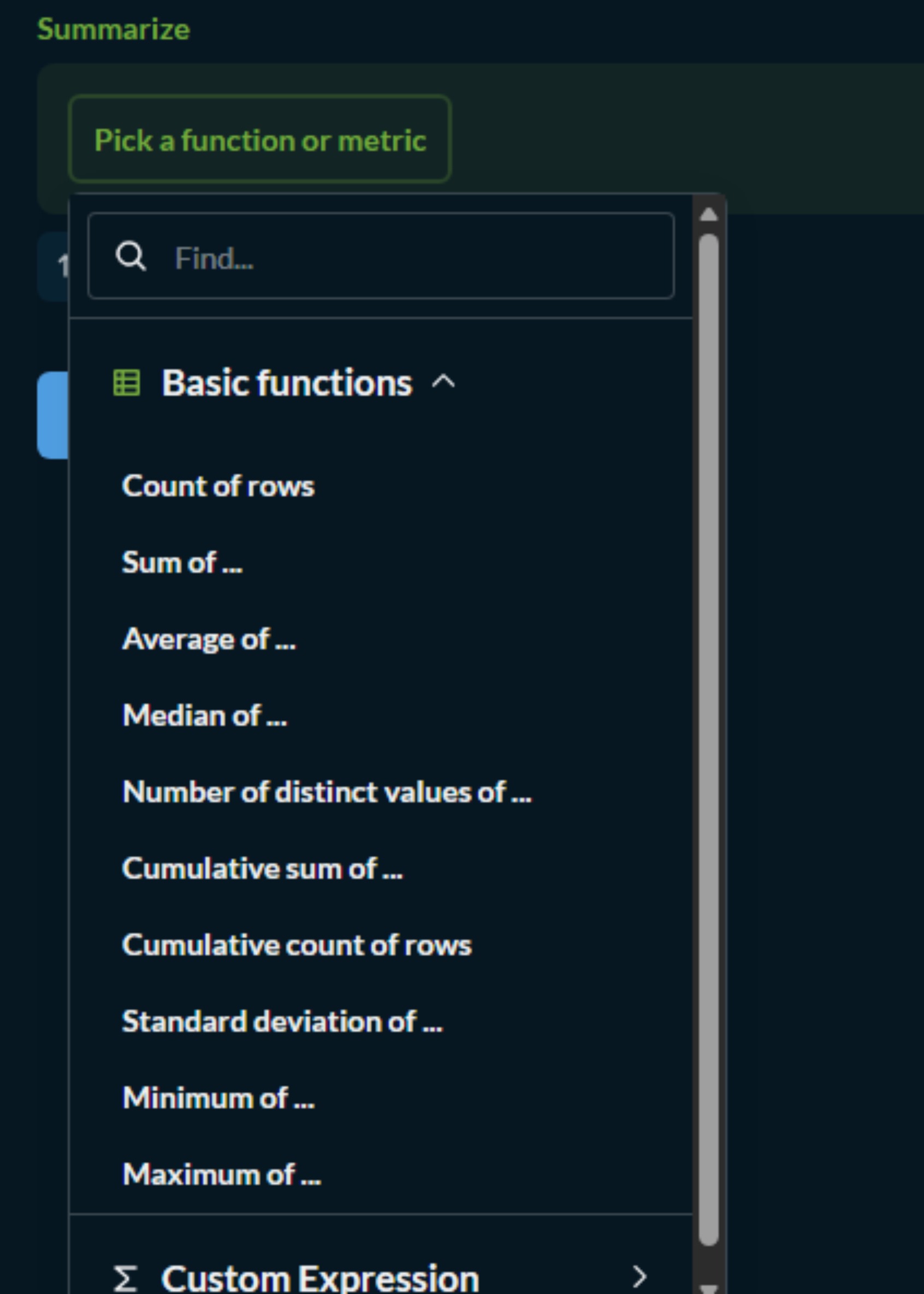
After that you can summarize by the availble options
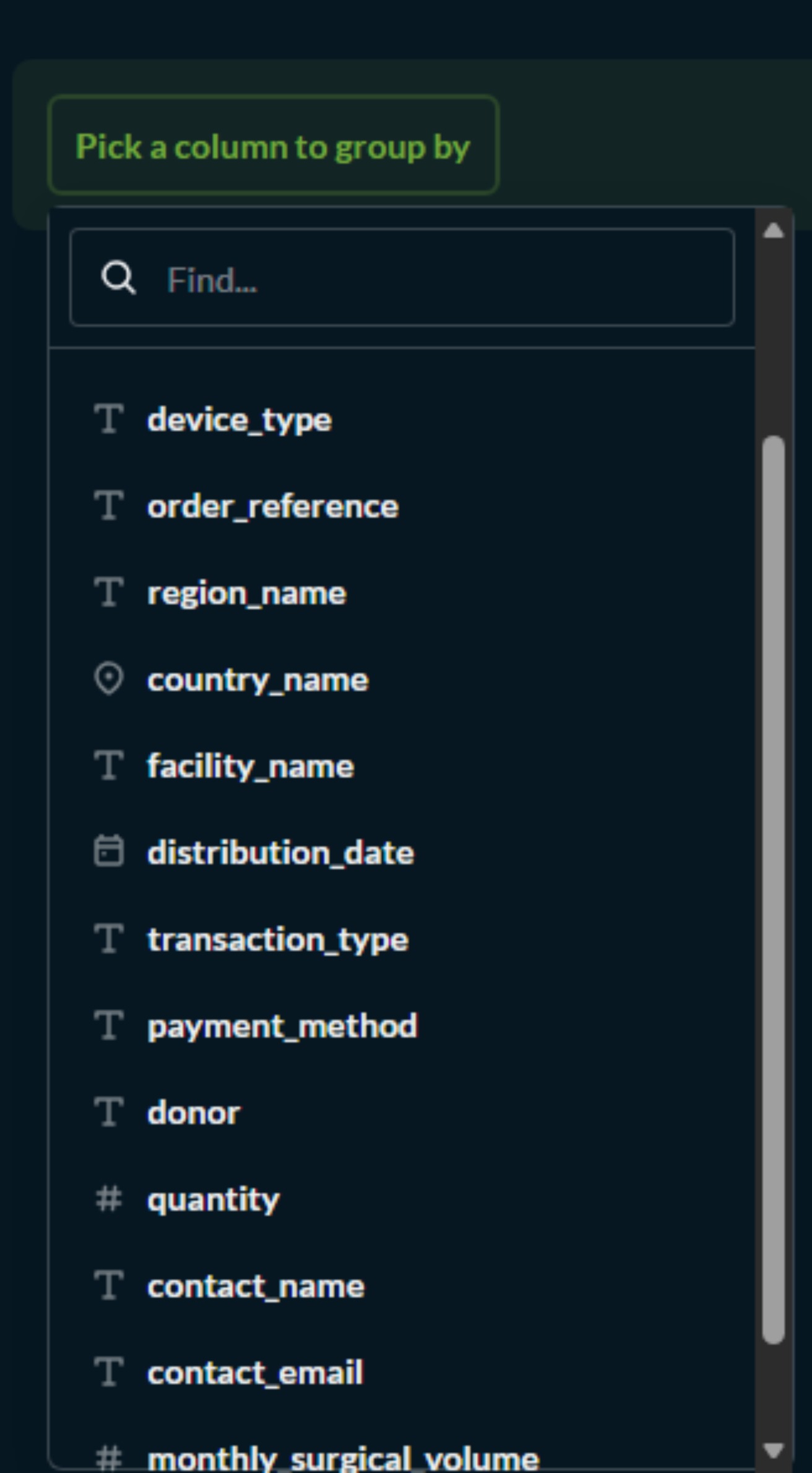
And you can also Group Columns you want to represent in the Visualization you are creating.
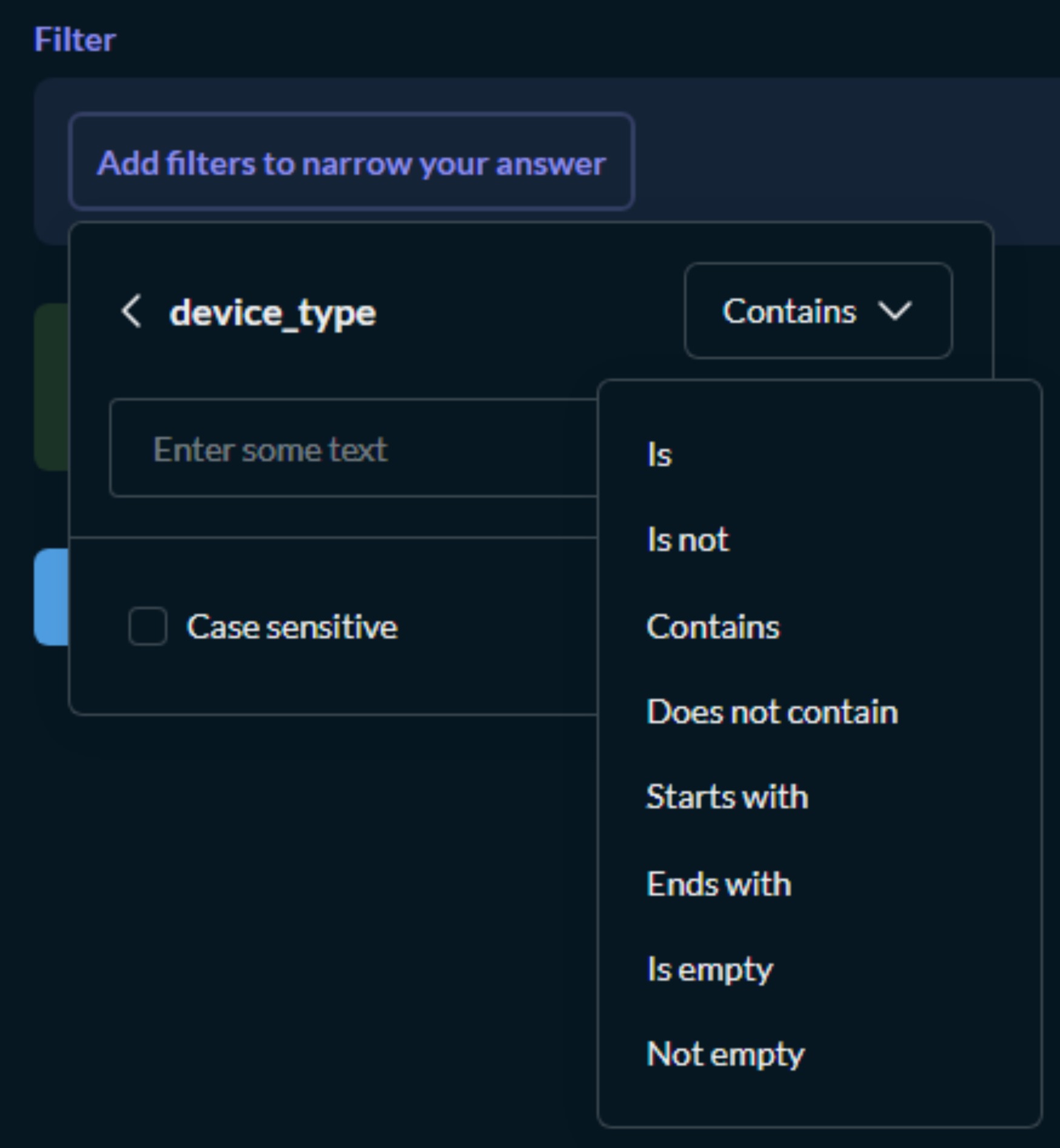
You have also Additional Features such Joining Data, Filtering, Sorting and So much more...
One of the most commonly used feature is also Filtering which has the following features and functionalities. Which you can also further configure as seen on the following picture.
- Configure your visualization:
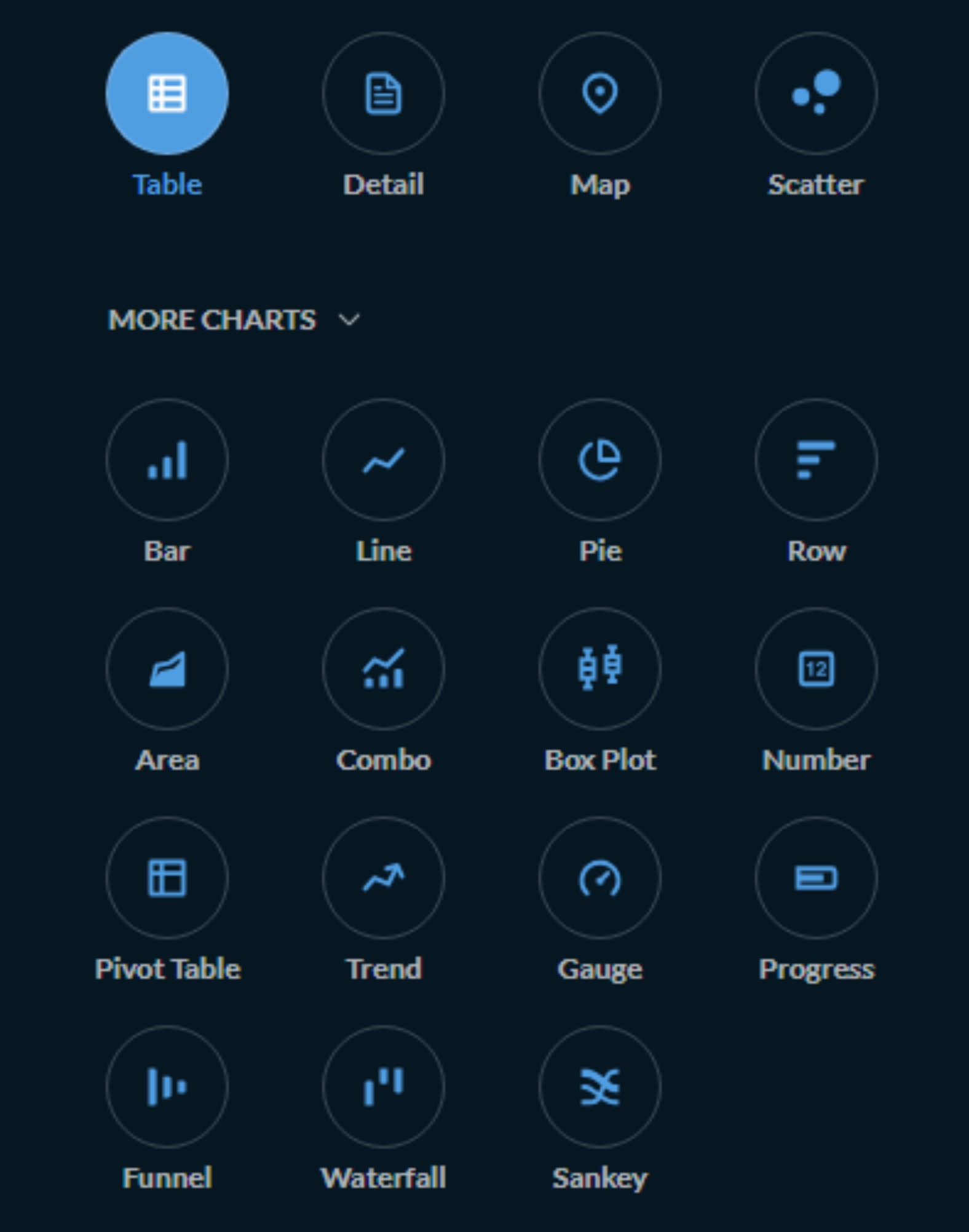
There are multiple Types of charts and visualizations for you to choose from with the appropriate data structure being constructed from your previous steps you will be able to choose from the following types of charts and visualizations.
You can follow on the following example to create your own Question/Chart accordingly or any other you want.
Example: Count Projects by Region - Select: projects table - Summarize: Count of rows - Group by: region_id - Sort by: Count (descending) - Visualization: Bar chart
Example: Training Completion Rate - Select: training_participants - Summarize: Count where completion_status = 'Completed' - Group by: training_name - Visualization: Pie chart
Example: Indicator Performance Trend - Select: indicator_actuals - Add filter: indicator_id = 5 - Summarize: Average of actual_value - Group by: period_year, period_quarter - Sort by: period_year, period_quarter - Visualization: Line chart
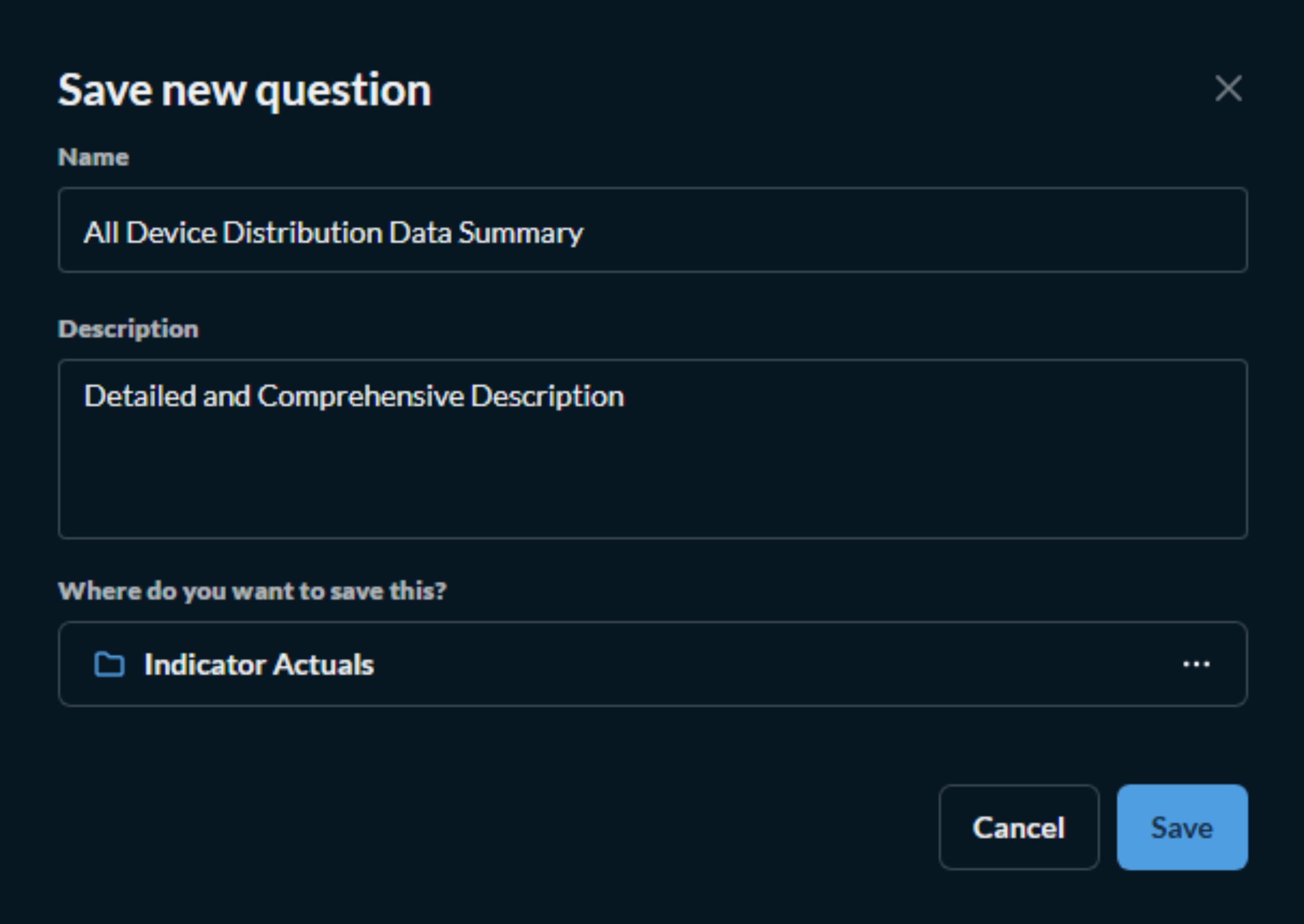
Creating a Custom Question (with Joins):
For more complex visualizations combining multiple tables:
- Click Create → Question → Custom question
- Select your starting table
- Click Join data to add related tables
- Configure joins:
data_values→indicators(ondata_element_id)training_participants→trainings(ontraining_id)-
beneficiaries→projects(onproject_id) -
Select fields to display
- Apply filters and aggregations
- Save with a descriptive name
Step 5: Arrange Dashboard Layout
Once you've added questions to your dashboard:
- Drag cards to reposition them
- Resize cards by clicking and dragging the bottom-right corner
- Use grid alignment to maintain professional appearance
- Group related cards together for logical flow
Step 6: Organizing the created Dashboard/Question/Query to a Desired Collection/Dashboard
Step 7: Saving
---
Example of Recommended Layout for PMI Dashboard:
┌─────────────────────────────────────────────────────────────────┐
│  Lifebox PMI Performance Dashboard - Q1 2026                    │
├─────────────────────────────────────────────────────────────────┤
│  [Region: All] [Year: 2026] [Quarter: Q1]                       │
├─────────────────────────────────────────────────────────────────┤
│  ┌──────────────────┐  ┌──────────────────┐  ┌───────────────┐  │
│  │ Total Trained    │  │ Devices Shipped  │  │ Active        │  │
│  │ 1,234            │  │ 856              │  │ Projects: 45  │  │
│  └──────────────────┘  └──────────────────┘  └───────────────┘  │
├─────────────────────────────────────────────────────────────────┤
│  ┌────────────────────────────────────────────────────────────┐ │
│  │ Indicator Performance (vs Target)                          │ │
│  │ [Bar Chart - 8 indicators with target lines]               │ │
│  └────────────────────────────────────────────────────────────┘ │
├─────────────────────────────────────────────────────────────────┤
│  ┌──────────────────────────────────┐  ┌──────────────────────┐ │
│  │ Training Completion by Region    │  │ Device Usage Status  │ │
│  │ [Pie Chart]                      │  │ [Donut Chart]        │ │
│  └──────────────────────────────────┘  └──────────────────────┘ │
├─────────────────────────────────────────────────────────────────┤
│  ┌────────────────────────────────────────────────────────────┐ │
│  │ Quarterly Performance Trend (Last 6 Quarters)              │ │
│  │ [Line Chart with multiple indicators]                      │ │
│  └────────────────────────────────────────────────────────────┘ │
└─────────────────────────────────────────────────────────────────┘
Managing Dashboards
Adding Filters to Dashboards
Filters allow users to dynamically explore data across all visualizations:
Step-by-Step:
- Click Edit on the dashboard
- Click Add filter button
- Choose filter type:
| Filter Type | Use Case | Example |
|---|---|---|
| Time | Date range selection | Q1 2026, Q2 2026 |
| Category | Dropdown selection | Region: Addis Ababa, Amhara, Oromia |
| ID | Specific record selection | Project ID: 101, 102, 103 |
| Text | Search field | Facility name contains "Hospital" |
| Number | Range selection | Training participants: >100 |
- Configure filter:
- Label: "Select Region"
- Column:
region_id(from data source) - Widget type: Dropdown
- Default value: "All regions"
-
Multi-select: Enabled
-
Map filter to cards:
- Select which cards should respond to this filter
- Click Save
Managing Dashboard Cards
Card Actions: | Action | How to Access | Description | |--------|---------------|-------------| | Edit | Click card → Edit | Modify question settings | | Duplicate | Click card → Duplicate | Create copy for modification | | Download | Click download icon | Export as PNG, CSV, or JSON | | Remove | Click card → Remove | Delete from dashboard | | Resize | Drag bottom-right corner | Adjust size (1-4 columns wide) |
Card Settings: - Title: Custom display name - Description: Add context for viewers - Visualization: Change chart type - Data: Modify filters or aggregations - Appearance: Customize colors and labels
Scheduling Dashboard Subscriptions
Automate report delivery to stakeholders:
- Click Subscribe on dashboard
- Configure schedule:
| Setting | Options |
|---|---|
| Frequency | Daily, Weekly, Monthly, Hourly |
| Time | 8:00 AM (or your preferred time) |
| Day | Monday (if weekly) |
| Format | PDF, CSV, or Image |
| Attachments | Include dashboard as attachment |
- Add recipients:
- Enter email addresses (separate with commas)
- Add custom message
-
Choose filter settings to include
-
Click Create subscription
Example: Monthly Report to Program Managers
Frequency: Monthly
Day: 1st of month
Time: 9:00 AM
Format: PDF
Recipients: <program@lifebox.org>, <mne@lifebox.org>
Message: "Please find attached the monthly PMI performance dashboard for review before the monthly meeting."
Sharing Dashboards
Option 1: Shareable Link 1. Click Share on dashboard 2. Copy the shareable link 3. Send to authorized users (requires login)
Option 2: Embed in Application 1. Click Share → Embed this dashboard 2. Configure embed settings: - Enable/disable filters - Set default parameters - Allow/disallow downloads
- Copy embed code:
Option 3: Public Link (with caution)
- Click Share → Make this dashboard public
- Confirm security considerations
- Copy public link (visible to anyone with link)
⚠️ Security Note: Only use public links for non-sensitive data
Organizing Dashboards with Collections
Collections help organize dashboards for different audiences:
Creating Collections:
- Click Create → Collection
- Enter collection name
- Choose location (Personal or Shared)
- Set permissions:
- Read: View only
- Write: Can add/modify
- Admin: Full control
Example of Recommended Collection Structure:
Lifebox Collections/
├── Quarterly Reports/
│   ├── Q1 2026 Dashboard
│   ├── Q2 2026 Dashboard
│   └── Q3 2026 Dashboard
├── Donor Dashboards/
│   ├── USAID Performance
│   ├── EU Progress Report
│   └── Global Fund Metrics
├── Operational Dashboards/
│   ├── Training Performance
│   ├── Device Distribution Tracker
│   └── Learning Network Analytics
├── PMI Indicator Dashboards/
│   ├── Outcome Indicators
│   ├── Output Indicators
│   └── Cross-cutting Indicators
└── Public Dashboards/
    ├── Public Impact Metrics
    └── Annual Results Summary
Archiving and Deleting Dashboards
Archive (Recommended for temporary removal):
- Navigate to dashboard
- Click ... → Move to trash
- Archived dashboards can be restored from trash
Permanent Delete:
- Navigate to trash
- Select dashboard(s)
- Click Delete permanently
- Confirm deletion
Duplicate Dashboard:
- Click ... → Duplicate
- Rename the copy
- Modify for new reporting period
Export/Import Dashboard:
- Click ... → Export
- Dashboard exports as JSON file
- To import: Create → Dashboard → Import
Dashboard Performance Optimization
Best Practices:
- Limit to 6-8 cards per dashboard for optimal loading
- Use filters to reduce data volume
- Set appropriate refresh intervals:
- Real-time dashboards: 5-15 minutes
- Daily monitoring: 30-60 minutes
- Weekly reports: No auto-refresh
- Use summaries instead of detailed tables when possible
- Limit historical data to relevant time periods
- Consider creating materialized views for complex queries
Troubleshooting Common Dashboard Issues:
| Issue | Solution |
|---|---|
| Dashboard loading slowly | Reduce number of cards, limit data range, check network connection |
| Filters not working | Verify filter mapping, check column names in source data |
| Data not updating | Check auto-refresh settings, verify database connection |
| Cards not displaying | Check question still exists, verify permissions |
| Chart showing no data | Verify filters include data, check date ranges |
| PDF export failing | Try downloading individual cards instead, check browser settings |
Available Dashboard Templates
The Lifebox M&E System includes pre-configured dashboards to help you get started quickly:
1. PMI Performance Dashboard
- Purpose: Monitor key PMI indicators
- Cards: 8 key outcome indicators, regional performance, quarterly trends
- Audience: Program Managers, M&E Team
2. Training Dashboard
- Purpose: Track training activities and participant outcomes
- Cards: Training completion rates, participant demographics, pre/post test results
- Audience: Training Coordinators, Program Managers
3. Device Distribution Dashboard
- Purpose: Monitor device inventory and distribution
- Cards: Devices shipped, devices in use, facility-level distribution
- Audience: Logistics Team, Program Managers
4. Learning Network Dashboard
- Purpose: Track Lifebox Learning Network engagement
- Cards: Active users, course completions, participant feedback
- Audience: Program Managers, Communications Team
5. Global Indicators Dashboard
- Purpose: High-level program overview
- Cards: Total reach, active projects, key outcome indicators
- Audience: Senior Management, Donors
Data Visualization Best Practices
Chart Selection Guide:
| Data Type | Recommended Chart | Purpose |
|---|---|---|
| Category comparison | Bar chart | Compare performance across regions |
| Trends over time | Line chart | Show progress over quarters |
| Part-to-whole | Pie/Donut chart | Show composition (e.g., device usage status) |
| Geographic | Map | Show regional distribution |
| Single metric | Number/KPI card | Display key figures |
| Correlation | Scatter plot | Show relationship between variables |
| Distribution | Histogram | Show frequency distribution |
Dashboard Design Principles:
- Clarity: Use clear titles and labels
- Consistency: Use same colors for same metrics across charts
- Context: Include targets or benchmarks for comparison
- Simplicity: Avoid clutter, focus on key metrics
- Accessibility: Ensure colorblind-friendly palettes
- Mobile Optimization: Test on different devices
Color Palette for Lifebox Dashboards:
- Primary: #2c7e9b (Lifebox Blue)
- Secondary: #3da58a (Lifebox Green)
- Areal Background: #FFEE7B (Accent Yellow)
- Tertiary: #ff6b6b (Accent Red)
- Neutral: #f8f9fa (Light background)
Frequently Asked Questions
Q: How often is dashboard data updated? A: Data is updated in real-time from the PostgreSQL database. You can also configure auto-refresh intervals (1-60 minutes) in dashboard settings.
Q: Can I export dashboard data? A: Yes. Click the download icon on any card to export as CSV, XLSX, PNG, or JSON. Entire dashboards can be exported as PDF.
Q: How do I share a dashboard with external partners? A: Use the share/embed option to generate a shareable link, or use dashboard subscriptions to email reports. For external sharing, consider security implications.
Q: Can I create my own custom charts? A: Yes. Use the Question Builder to create any visualization, then add it to your dashboard. No SQL knowledge required.
Q: What if my data isn't showing correctly? A: Check your filters, verify date ranges, ensure you've selected the correct data source, and confirm your user permissions.
Q: Can I schedule automatic report emails? A: Yes. Use the Subscribe feature to schedule daily, weekly, or monthly email delivery of any dashboard.
Getting Help with Visualizations
If you need assistance with creating or managing dashboards:
- System Documentation: Access the Metabase user guide from the Help menu
- Support Email: Contact support@merqconsultancy.org
- User Training: Schedule personalized training sessions with the system administrator
- Troubleshooting Guide: Refer to the Section Managing Dashboards for common dashboard issues
More Steps and Guide can Be found through the Official Documentation of Metabase
Metabase Official Documentation (RECOMMENDED!)
Now that you understand how to visualize and interact with data, you can move on to Data Entry & Management Section, where you'll learn how to enter and validate as well as a detailed walkthrough of Data Entry and Management. 🚀