Dashboard Navigation
The dashboard provides a visual summary of key indicators and program performance. It allows users to quickly view trends, monitor progress, and identify gaps across different levels such as region, country, and facility. The dashboard has its own tabs including global indicators, training performance, Lifebox learning network performance and device distribution and selected indicators from DHIS2 and PMI. Users can download visuals in different formats using the download option located at the top-right corner of each chart.
- All in one: summarized selected global indicators from the logical framework
- Training: summarized training related performances
- Device distribution: Summarized device distribution related program performances
- Lifebox learning network: Summarized learning network related performances
- PMI – summarized key performance indicators listed out in the logical framework
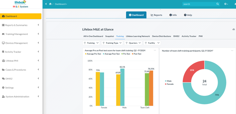
Figure 6. Dashboard interface showing visual summaries of key indicators and program performance.
Info
The information tab within the dashboard presents the lifebox's result chain from system level support to sustainability. In addition, scrolling down displays previously mentioned roles and permissions. Users profile with searching/advanced search options and notifications displayed in the right upper corner.
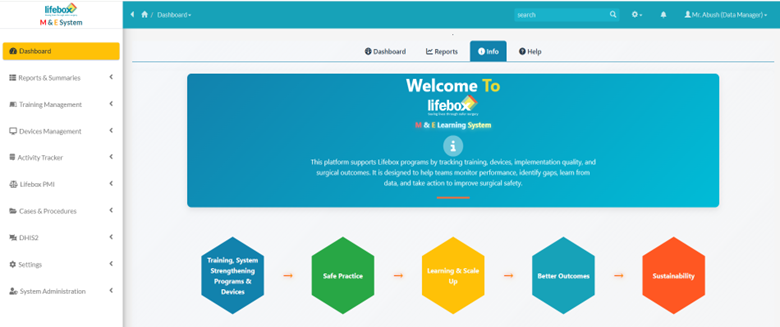
Figure 7. Information tab displayed lifebox's result chain within the system
Generating reports
The system allows users to generate various reports to monitor program performance, analyze trends, and support decision-making. Reports can be generated for different indicators, result areas, time periods, and organizational levels (e.g., region, country, or facility). The reports and summaries menu on the left panel provides options to view system summaries and reports, and the gear and printing icon in the right upper corner allows users to download the results in different formats.
Users can apply filters, review the report and verify the data displayed and download or export if needed. Reports may be scheduled or automated for recurring monitoring purpose.
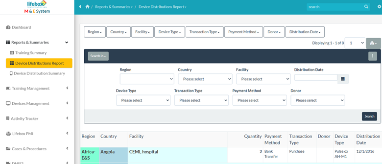
Figure 8. The Reports and Summaries menu provides access to system reports and allows downloading results in different formats
Now that you understand how to navigate the dashboard, you can move on to Data Visualization, where you'll learn how to interpret and analyze health system performance data effectively in various data visualization types. 🚀